Actimet redesign
How can thinking outside the box help
to find a suitable solution?
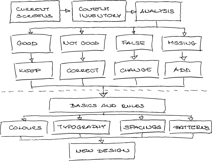
The process
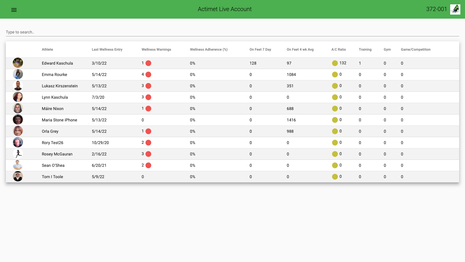
- Browse all pages.
- Read and organise user research results.
- Collect an element inventory.
- Analyse the screens and the visual components from the perspective of:
- user research,
- purpose and result,
- RIRU (recognition, intelligibility, readability, usability),
- branding,
- ergonomy.
- Create a four-group separation in the inventory (good, not good, false) and list the missing components that need to be added.
- Select typical screens that contain most of the elements in the inventory.
- Create drafts.
- Build the design basics and rules.
- Design the necessary screens.
- Test the screens with the users.
Team charts
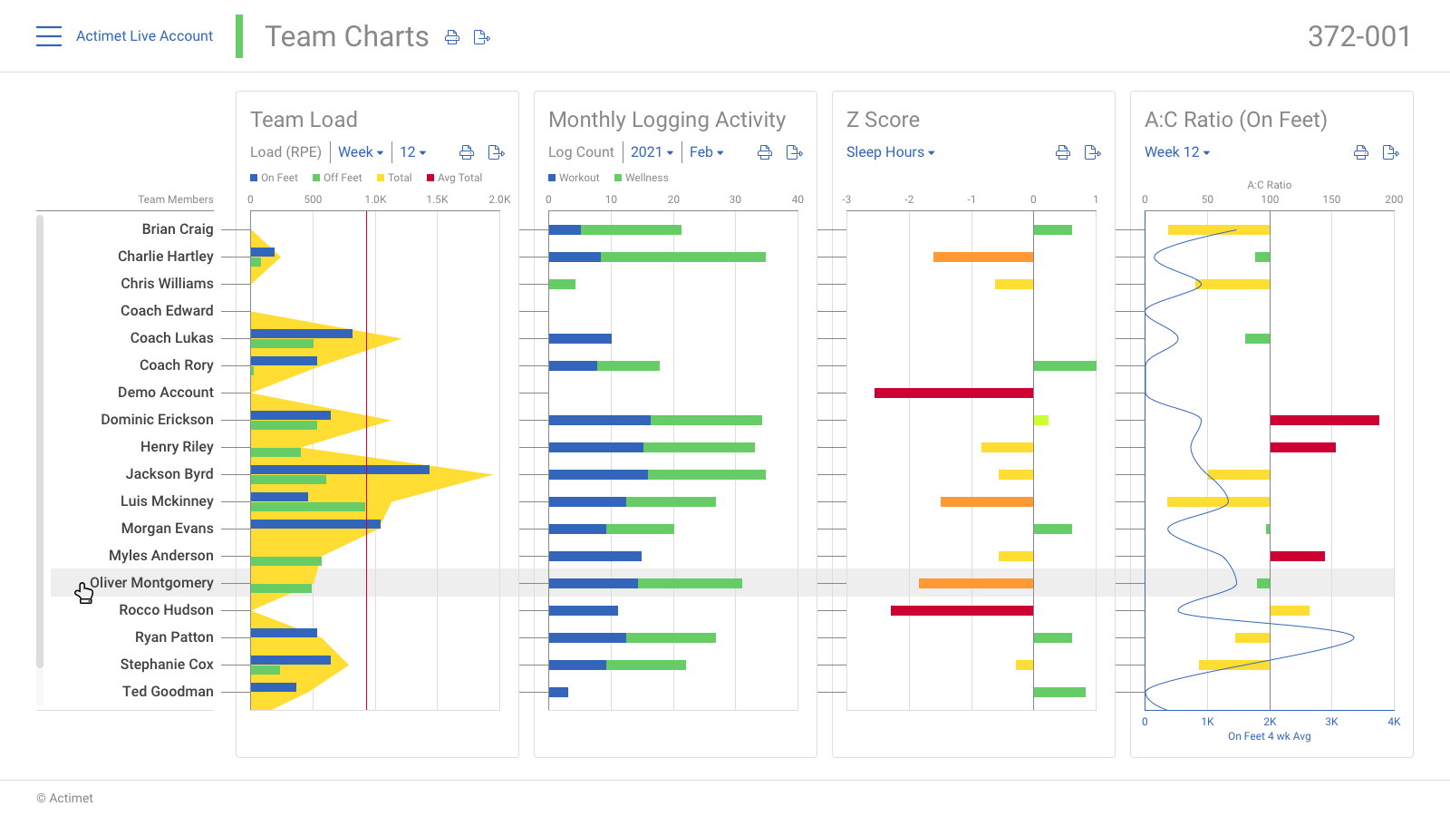
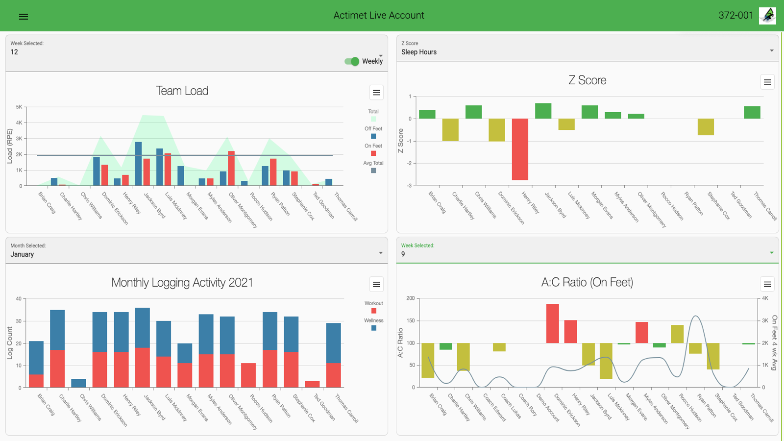
The last screen I needed to redesign was the ‘Team charts’. It was the most interesting and the most challenging task.
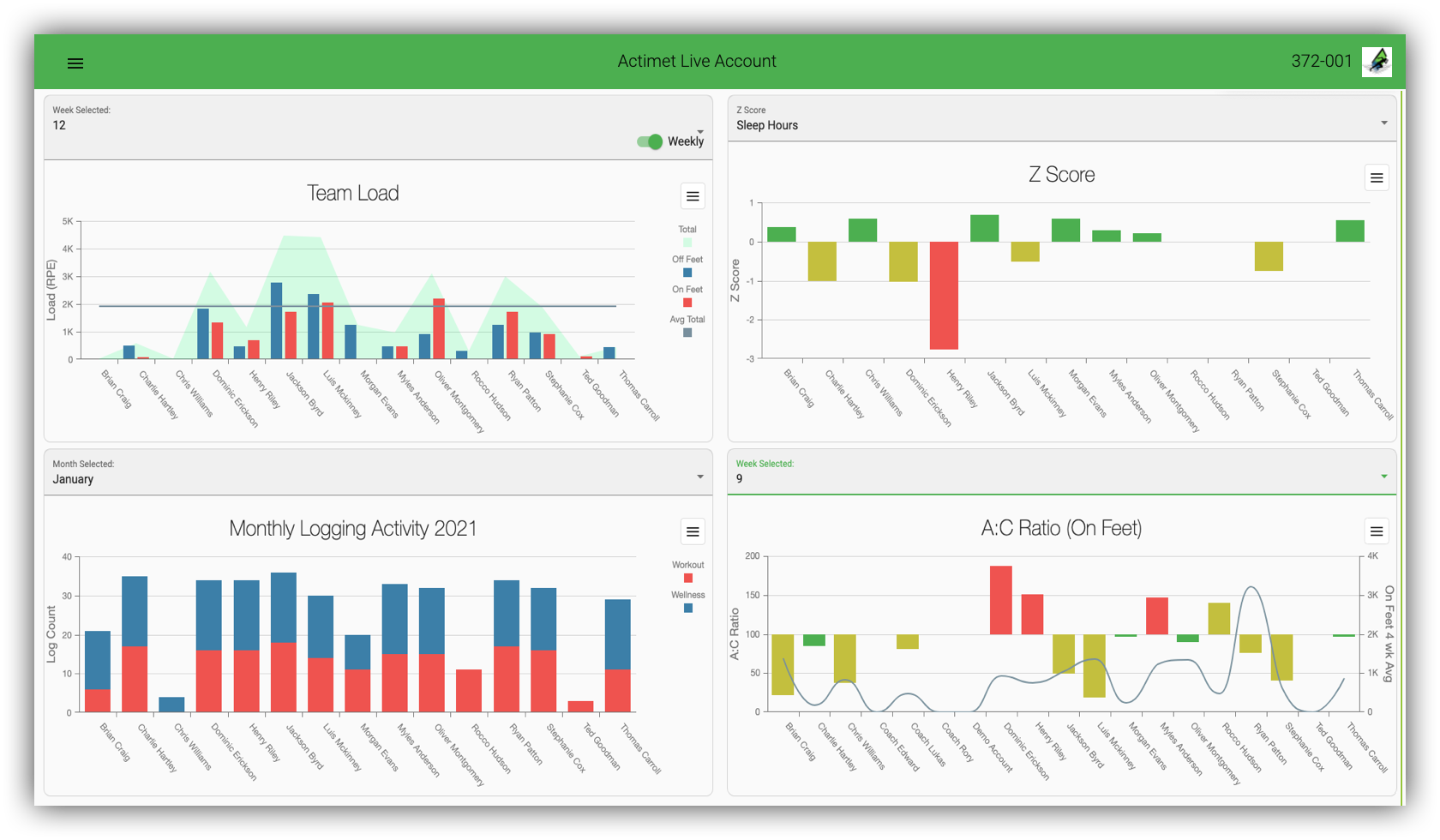
Based on the coaches’ feedback, the current screen content is difficult to understand, follow, and recognise. A better solution is needed.
The original screen ignites some questions:
- What if a team has 60 or more members? Horizontal scroll on each chart?
- The charts reflect the athletes’ progress, but it is hard to see the individual athlete’s progress sum.
- It is hard to see the individual athlete’s overall progress and relation to the other teammates.

Analysis
- There are four charts with the same team members.
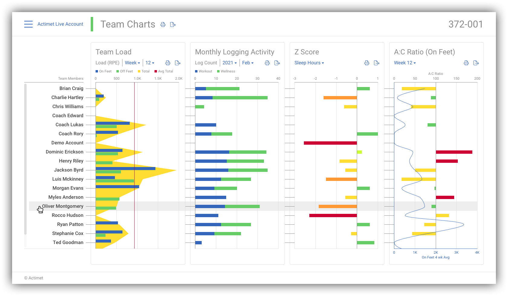
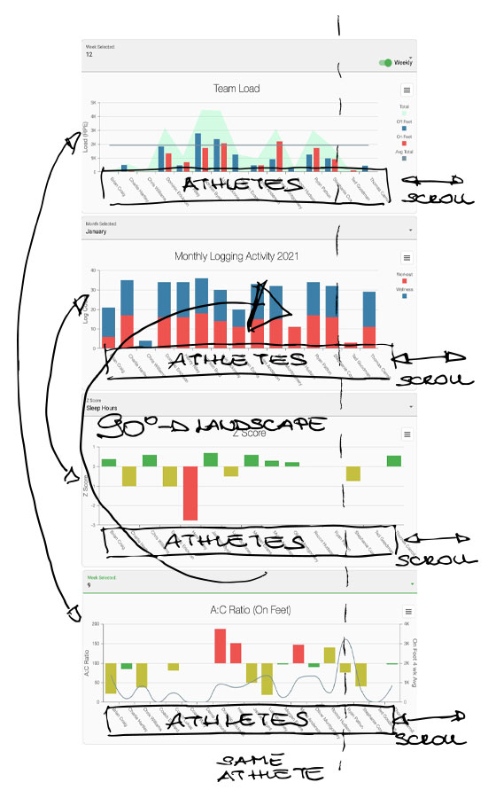
- Moving the charts under each other places the individual members in the same vertical position.
Rearrange charts
- The horizontal scroll is still not solved if there are more members than the horizontal space on the screen.
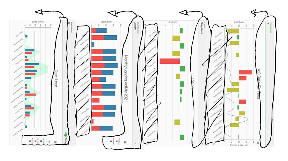
- By turning the charts 90 degrees clockwise, the scrolling will turn to the vertical orientation, which is more familiar and ordinary for the users.
- After the turn, the charts need to be rearranged so that they are in the original order from left to right.
Final correction
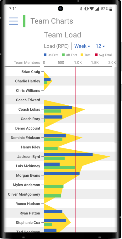
- With this solution, we don’t need to repeat the member names.
- The charts’ headers, legends and options need to move above the graphs.
This solution presents the data in an easy comparison layout, where even the individual members’ progress and even the team results can recognise.
Mobile screens
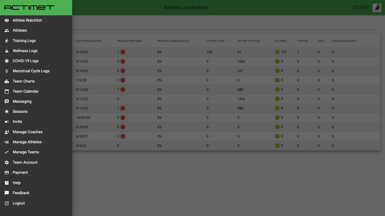
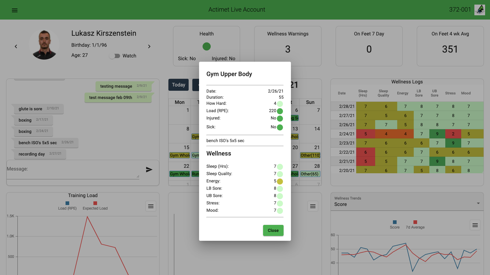
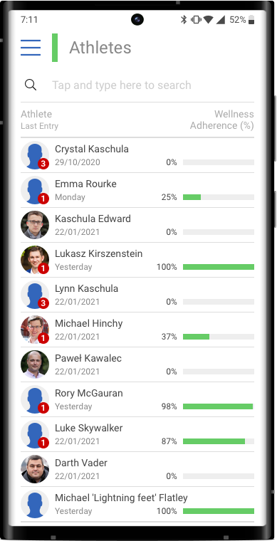
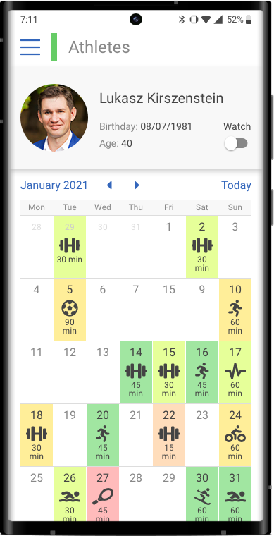
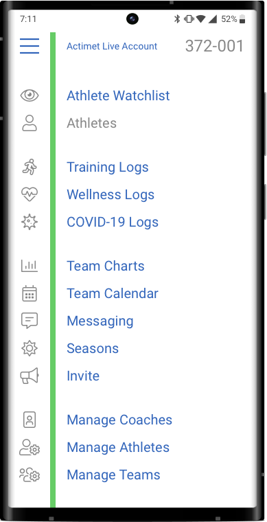
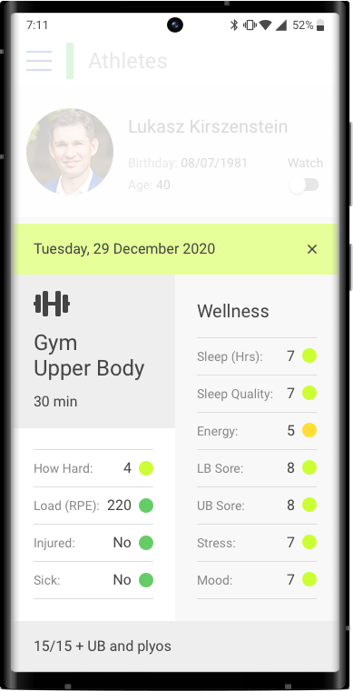
A mobile version of the screens was not a requirement in this project because the mobile app has different content and focuses on progress recording only.
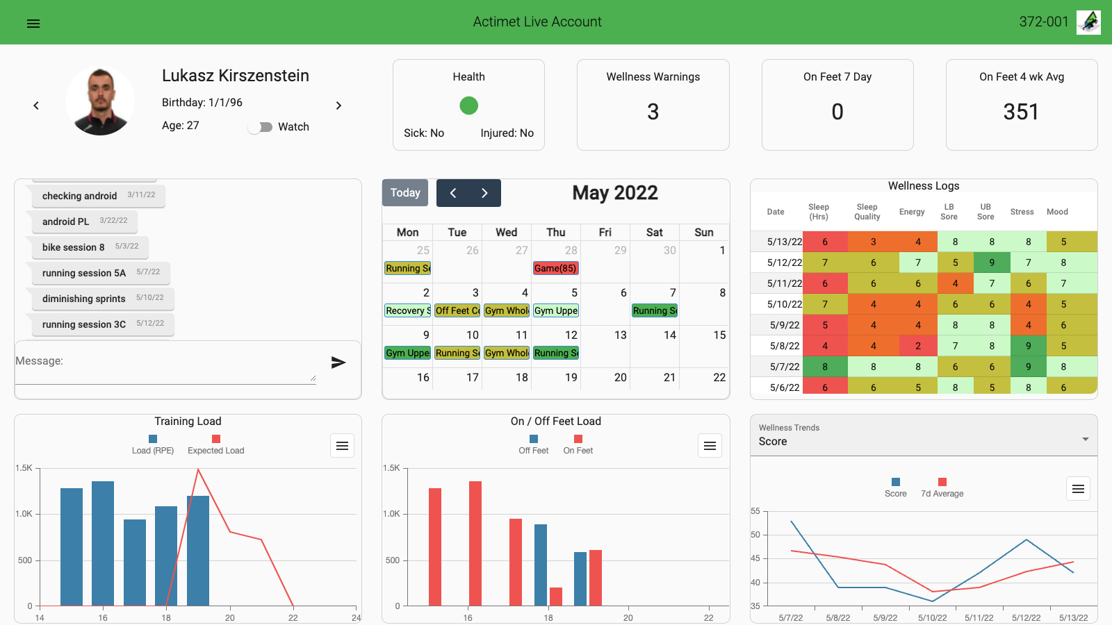
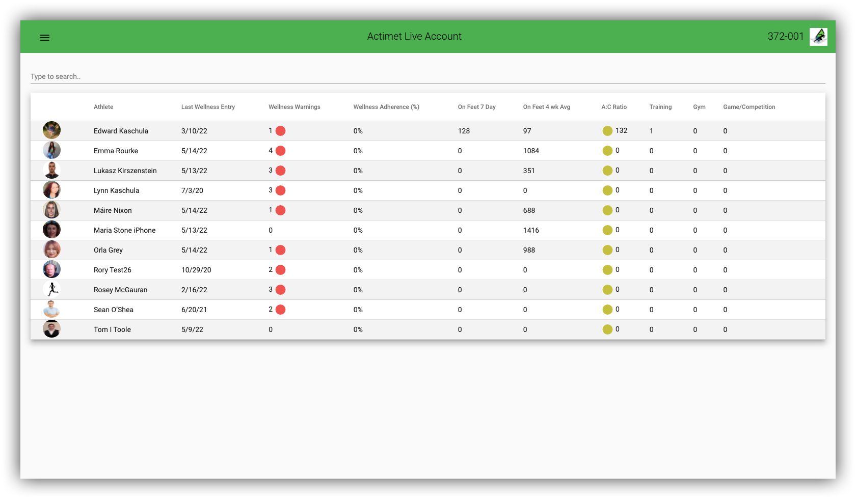
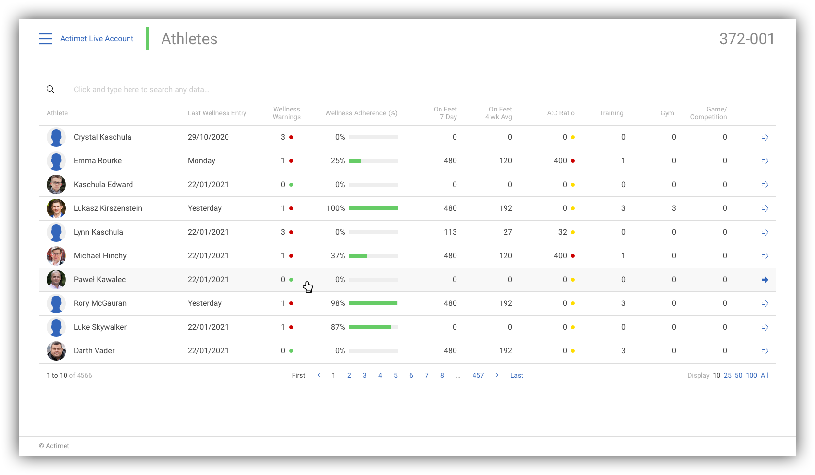
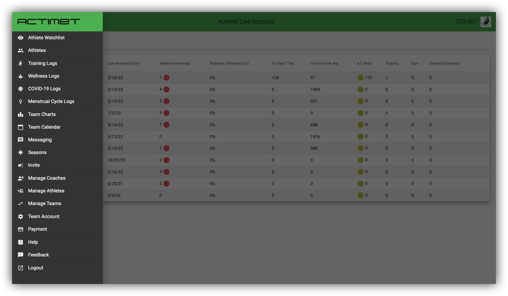
I made the mobile versions of the above designs to check if the concept is mobile-friendly and not only good for desktops and laptops.
Conclusion
The Actimet developer team was kind, friendly and helpful. I really enjoyed the design work with them.
This job was quick (by request) and missed some critical UX/UI steps (I will list them below) that can make this design project much better. However, the result is nice and clear. The layouts now have patterns on which the next design rounds can build.
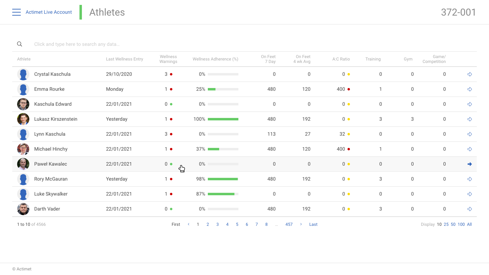
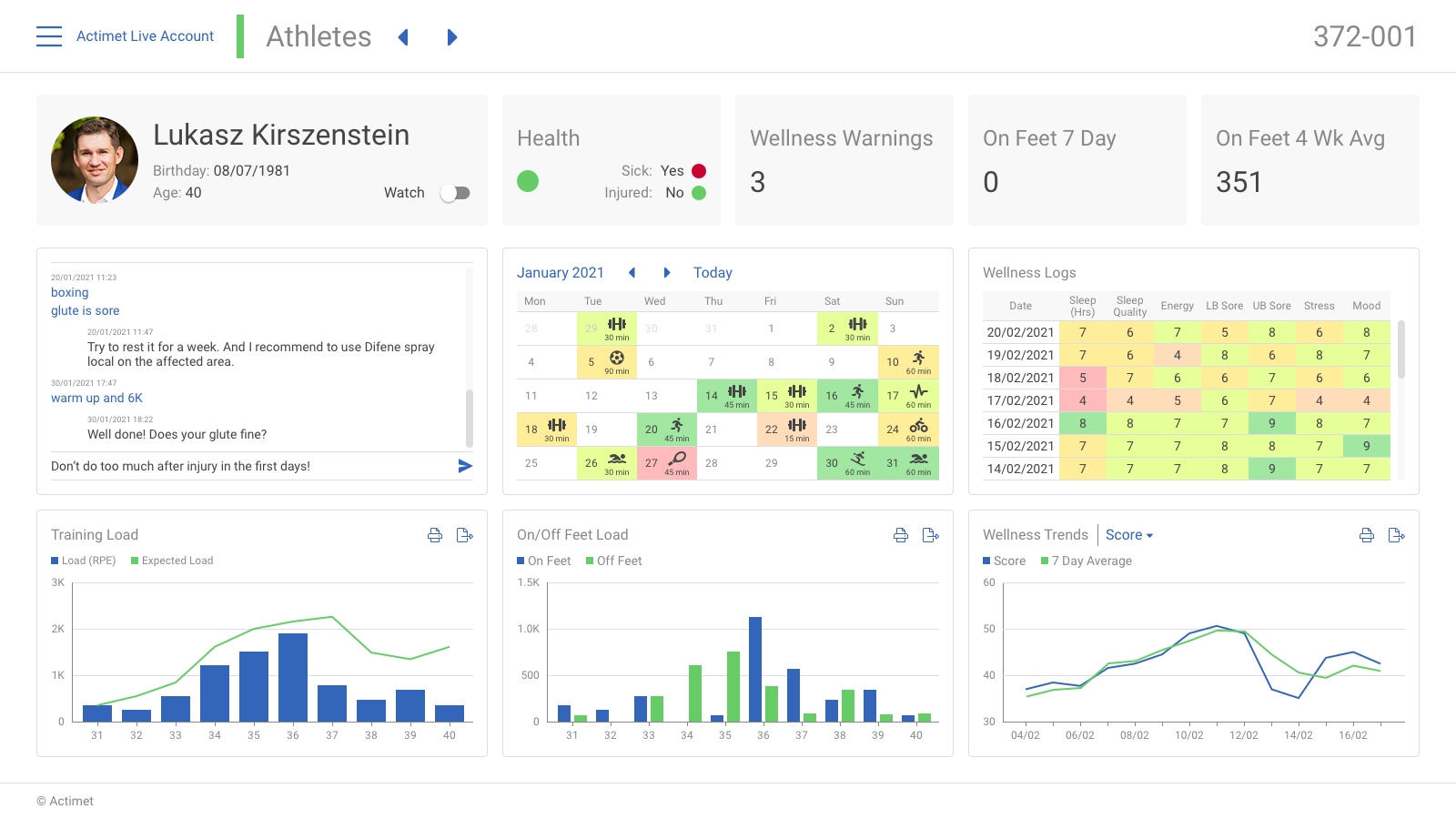
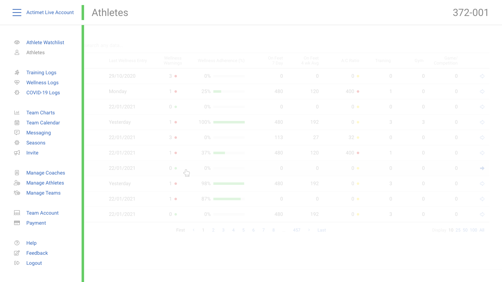
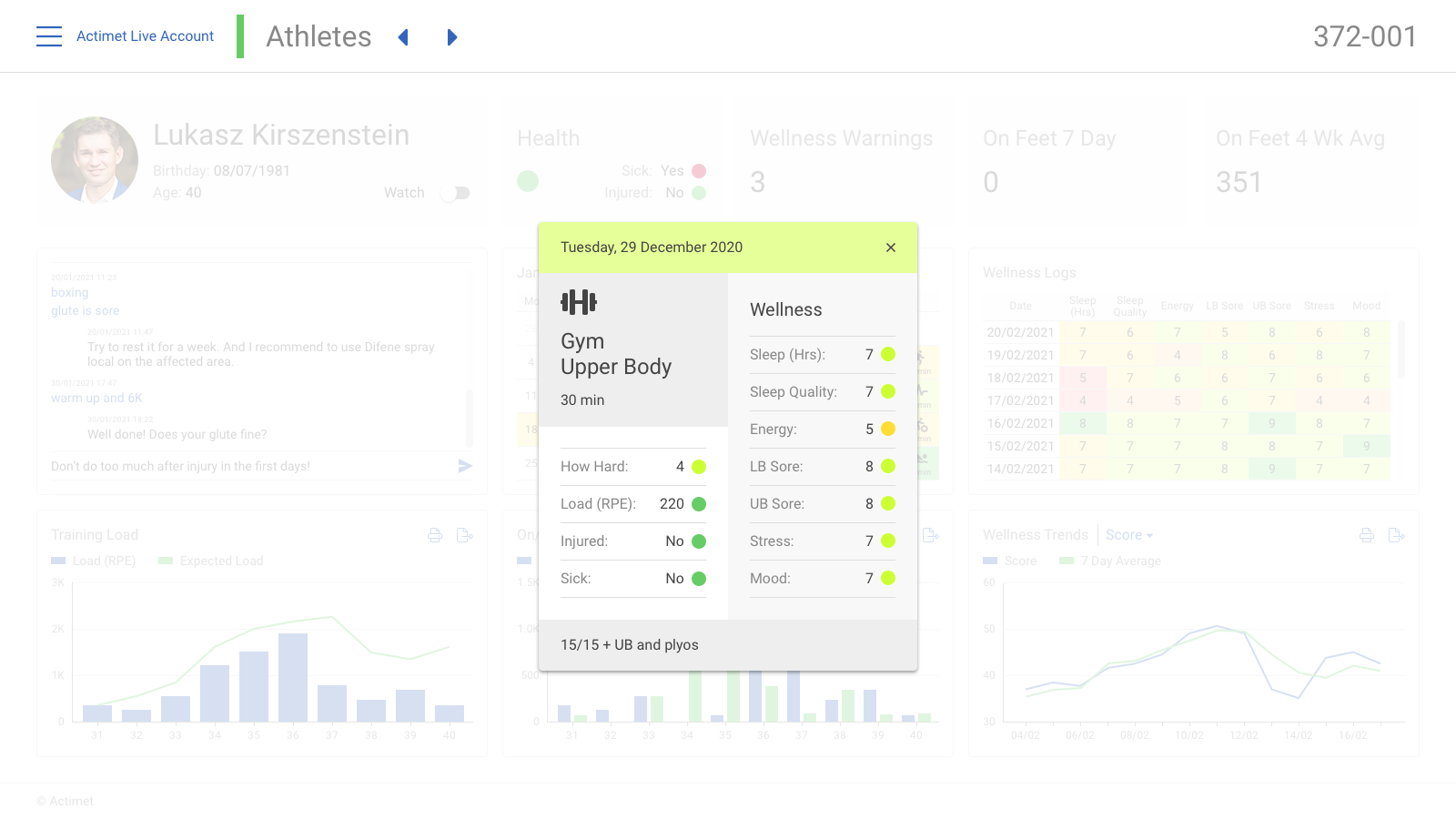
The new screens above give a good branding for the Actimet while the ‘Team charts’ page demonstrates the power of the “thinking outside of the box”.
User satisfaction
Actimet loves the new layouts. They only have one concern: how to code the ‘Team chart’ design because they didn’t find a plugin or library to make it work. That is the only cause why their satisfaction is not yet 100%.
My satisfaction
75%. Yes. I think essential things are missing to have a “complete” design. That is why quick work can be good enough, but a great job needs more time.
What have I learnt?
- More data visualisation experiences.
- More infographics skills.
- Drop the standards sometimes help to find a better solution.
The Actimet project is 95% about data recording and visualisation. The experiences I got from the Rightsline project were essential to this redesign. There was a wide range of new explorations and investigations, as well as breaking out from the box and thinking utterly differently than before.
What is missing?
- Generalisation
The charts on the details page and the ‘Team charts’ have different views. This should be reviewed. - Colour finalisation
The selected colours are not perfect yet. There are some issues with them, for example, with the light green. - Design System
We need a design library to easily design the rest of the screens or even ensure that the created screens have the exact same components.
What will I do differently next time?
- More drafts (low fidelity mockups) before beginning the design.
- Earlier defined and created design patterns, which helps to make changes globally faster.
