A dinosaur in design:
the input field
This topic will ignite a lot of dispute. But it is already too late to talk about it. Digital forms are the same age as computer screens. Today, we still have almost the same as in the past; it’s just a bit nicer.
In the beginning, the programmers separated the input fields on text-only (character) screens from the read-only content by inverting the character spaces. After the screens became colour-coded, different-coloured backgrounds were used.
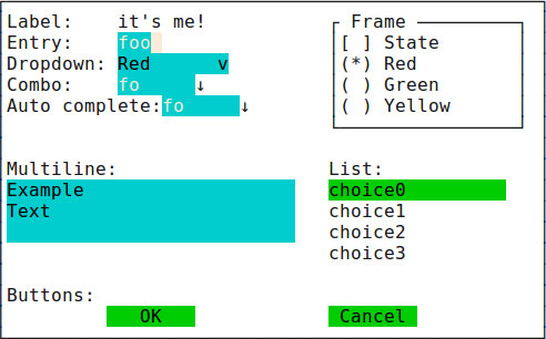
Input fields from the 80's 80x25 text-only screen.
Then came the graphic screens (System 1 in 1984, Windows 1.0 in 1985), and the developers framed the spaces where the users could type in content. This layout came from the paper forms, where the users had to limit themselves to the filling area to write. This is what we still use.
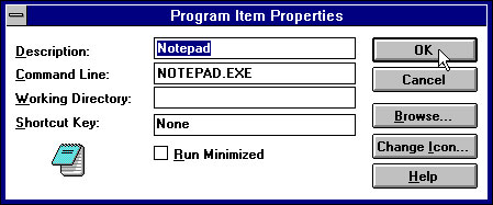
Input fields in a Windows 3.1 form.
As a user, I wouldn’t say I like the input field boxes. Why? Because there is currently a wide area for designers to show their artistic talent in a straightforward technical subject. As many designs as possible, as well as many different input fields, will be found. That won’t be a problem if they don’t cause trouble or confusion for the users. But they do. Different designs have different paddings inside the frame, and today’s trends use that big padding so that users cannot be sure if they typed ten spaces in the front of the input content or if that’s part of the design.
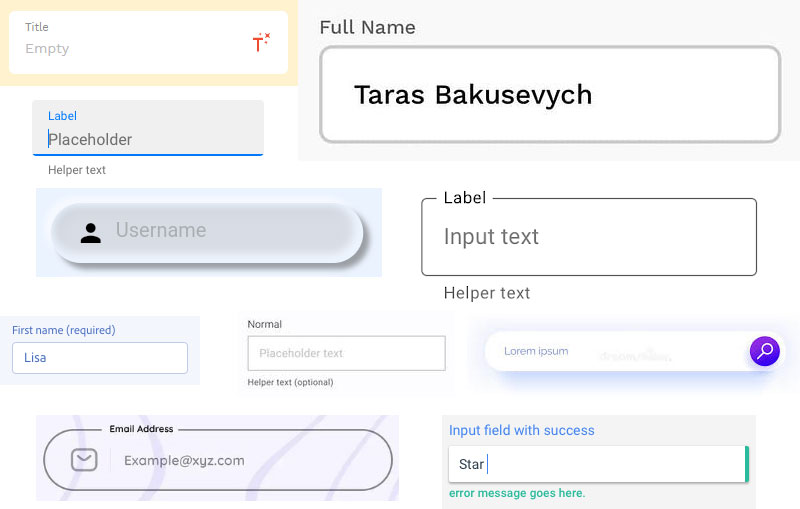
These are some examples from a quick search result list. All of them are in 1:1 size
UI should follow the UX, and there are no compromises. If something nice doesn’t work, don’t use it that way. Change it. UX is not about niceness or beauty. It helps the users be confident about why the product solves their problem. To make a coffee from water and coffee beans, to draw out a screw from a hole or even to input the necessary data in an input field.
Following the manual routine and using the same layout in digital solutions has its purpose. But if it causes confusion or uncertainty, we (UX/UI designers) must find a better solution.
I see the future in the line field with a label and placeholder helper. The input begins at the start of the line and ends at the end of the line. An extended version uses an animated label or a label under the line, as in some paper forms. The placeholder helper appears on click when the label moves from the field.
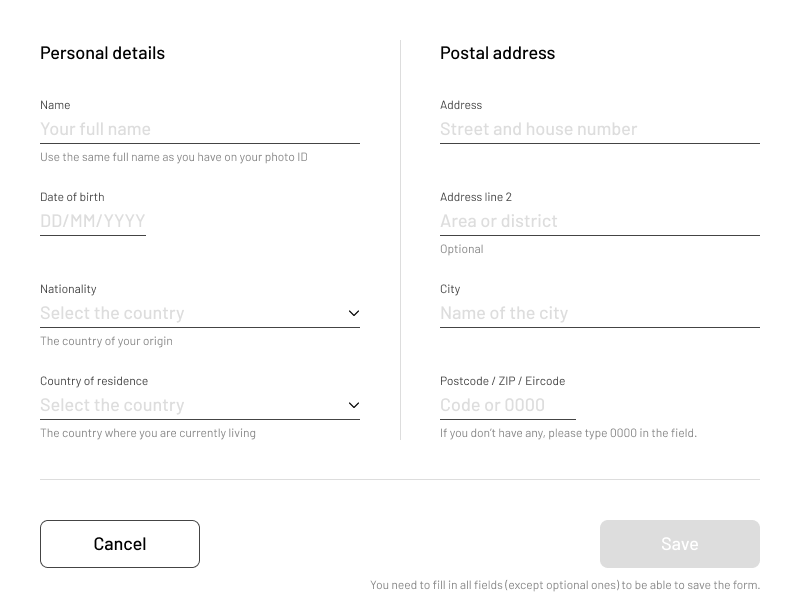
A simple version of mine (empty).
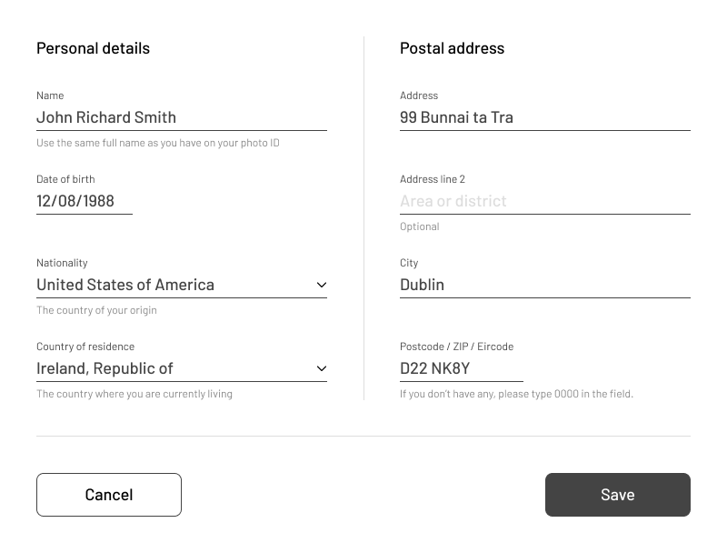
A simple version of mine (filled).
What are the benefits of this solution?
- There are no paddings on the sides, and it clearly defines and shows the field’s range.
- The label is not separated from the input content but has a better relation.
- Fewer details (traffic) on the screen give a clearer view.
I’m open to discussing this topic. Maybe we can find a better solution together. The only thing I’m sure of is that the time of the “classic” input fields expired.